EMME Salute
Visual identity for a medical clinic
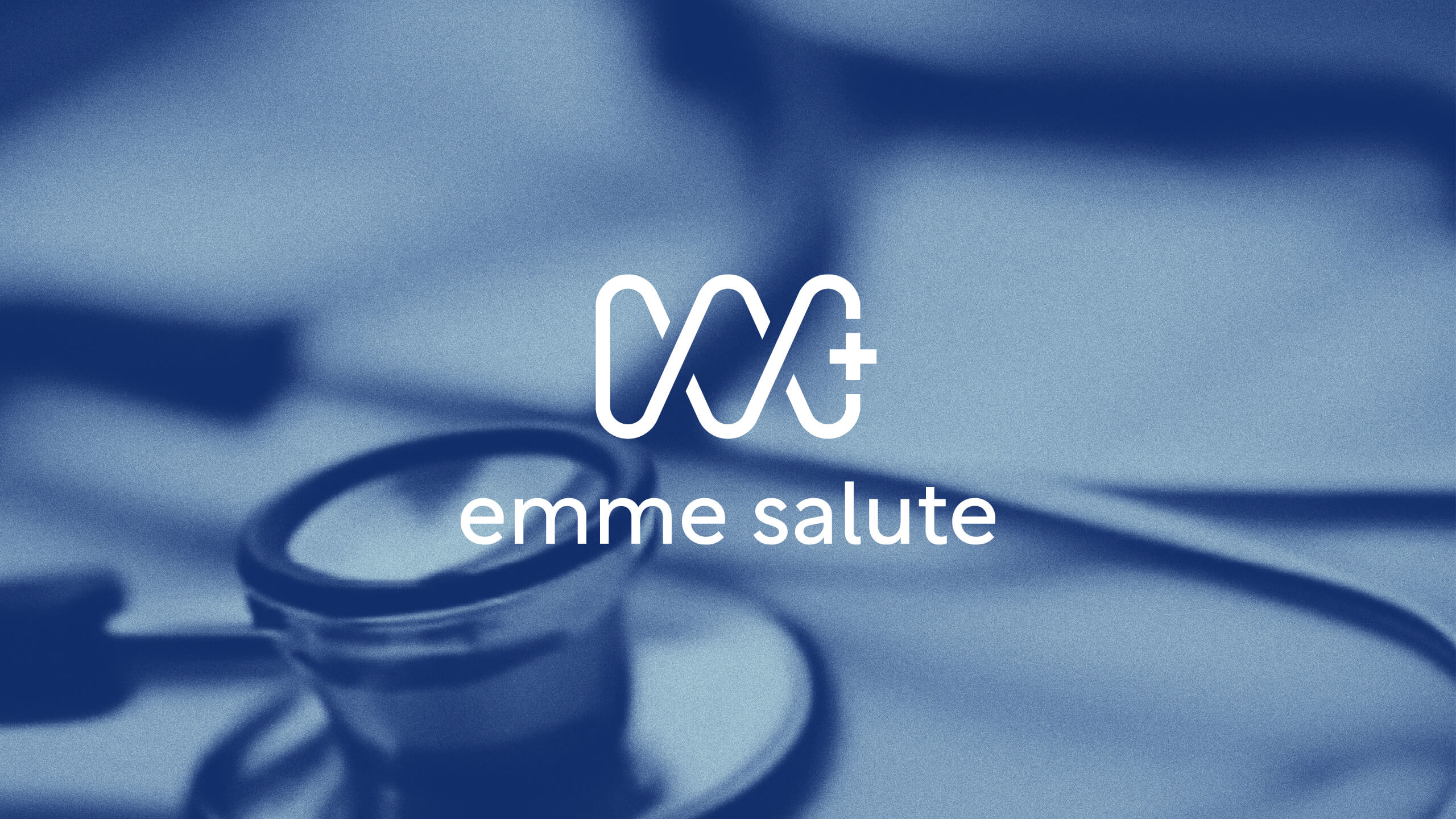
Emme Salute is a modern and welcoming medical center that places the patient and their well-being at the heart of its philosophy.
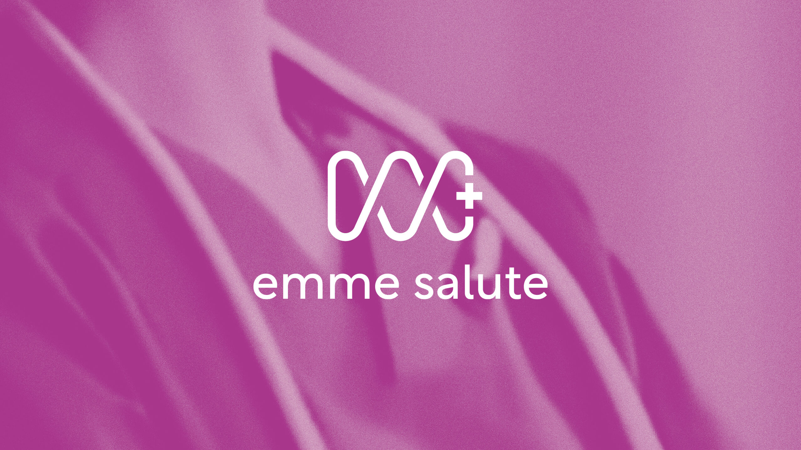
The visual identity was inspired by the helical shape. Geometric and sinuous, this form has many examples in nature and is often used in artistic and architectural contexts. In classical iconography, the helical structure also recalls the Rod of Asclepius, an ancient symbol associated with medicine.
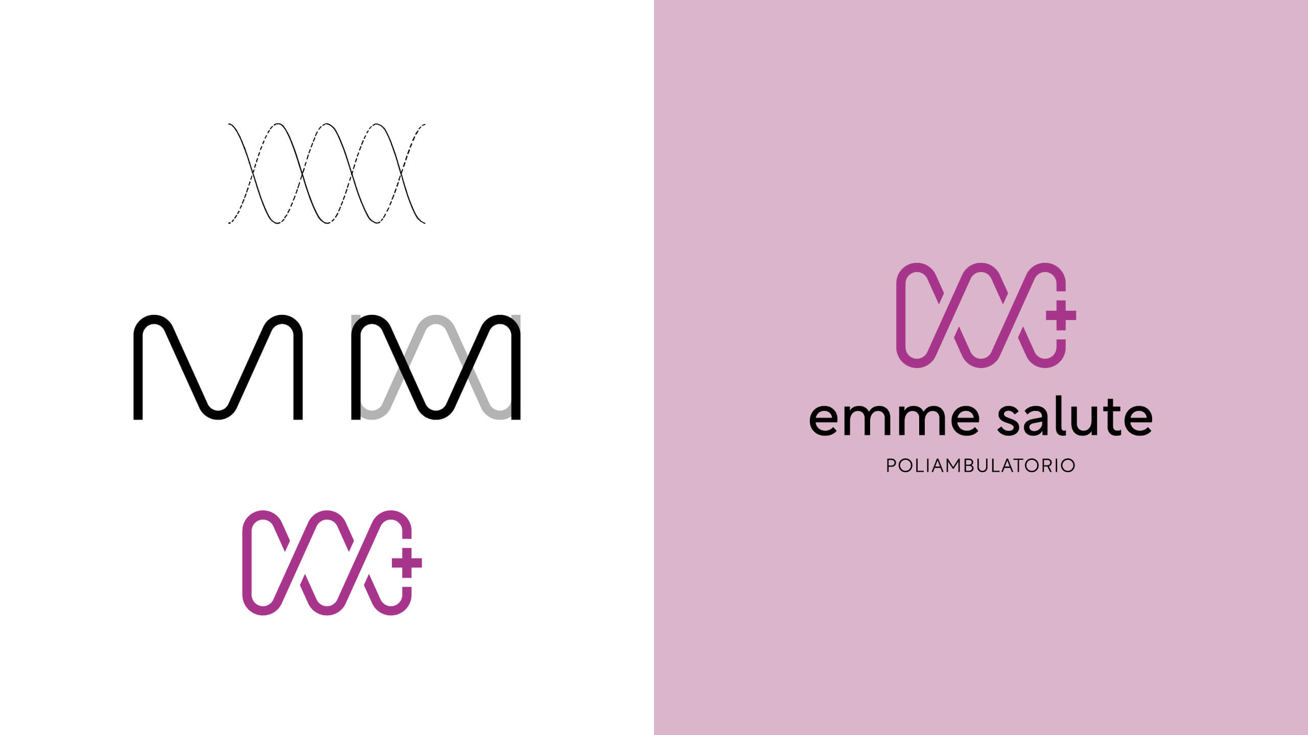
For the logo design, we started from these concepts to create an organic shape that also stylizes the letter M, becoming both a symbol and a monogram.
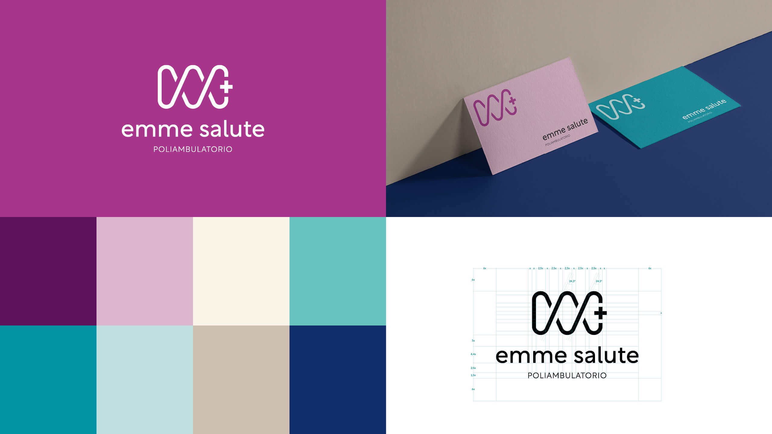
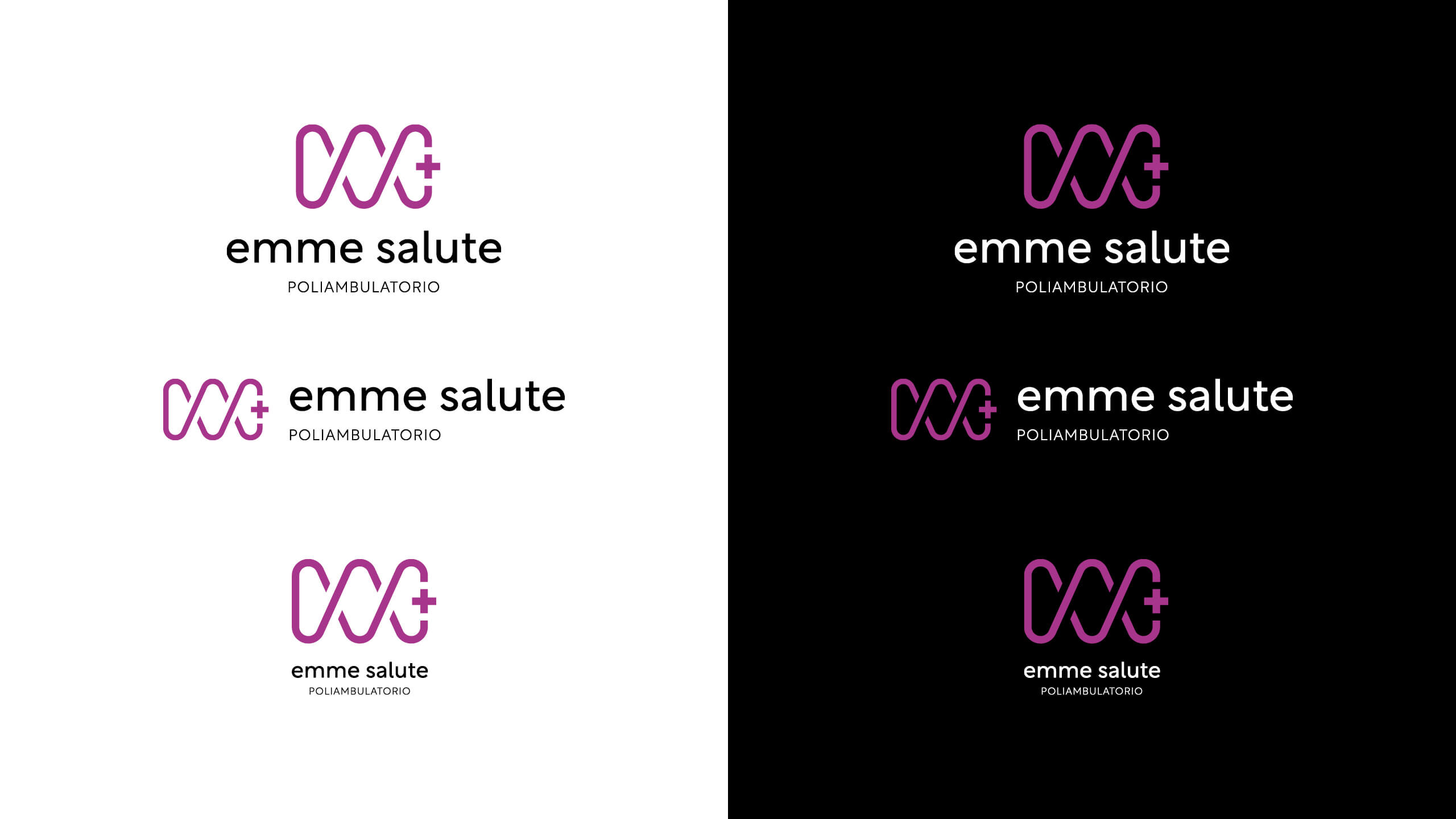
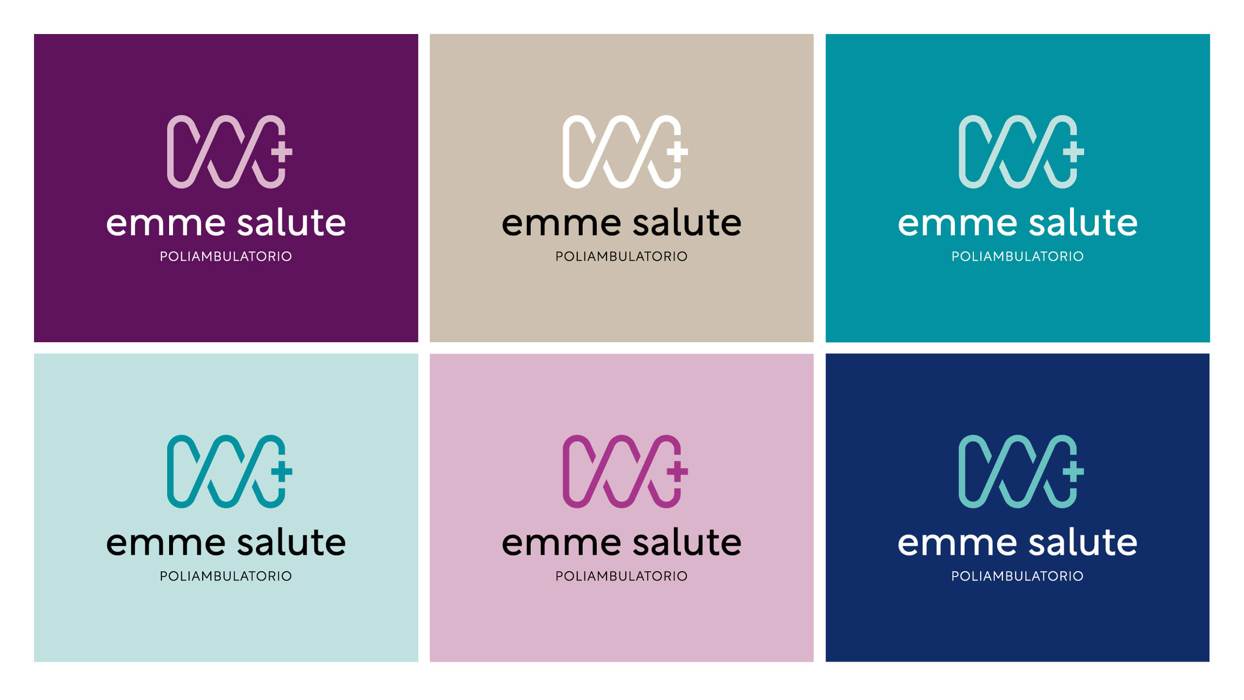
The color palette, designed to reflect the values of modernity and authority that guide the project, combines colors traditionally linked to the medical field with fresher and less conventional tones.
Art direction: Laura Bortoloni
Graphic design: Sara Paioncini

